


By Kara Sweet
We have all heard the saying, “Don’t judge a book by its cover.” We are inundated with clichés and fables reminding us to look under the surface to what lies beneath. We know that “all that glitters is not gold” because we may be tricked by “fool’s gold.” We might even miss kissing the frog because we don’t believe there is a prince underneath.
All of us try to live by these mottos in our daily work. We make an effort to see beyond the surface when we move forward on many important choices in our lives, like friends, dates, or jobs. However, these lessons are much easier said than done for many aspects of life, especially when we are facing an aisle full of wonderful bottles of wine in a liquor store.
Let’s face it—when it comes to wine, consumers do judge by the cover. Research proves that the art and design of wine labels matters. Real Simple Magazine reported a small study completed by Elizabeth Loftus and Fred Helmstetter, both PhDs, which showed how wine drinkers judge their bottles by what’s on the front. Test subjects remembered the more graphic labels of bottles 94 percent of the time, while only remembering the traditional labels 68 percent of the time.
Of course, we could quibble over what constitutes a “graphic” label or a “traditional” label, but the bottom line remains the same: the outside matters. The art and design on the exterior may have little to do with what is inside, yet many winemakers take great pains to create an outer cover that shows some aspect of the wine, something with which drinkers can identify, something symbolic about the wine itself.
It is often difficult to pinpoint the parts of our favorite labels that we love so much. It is hard to put into words why we judge the cover. In order to make sense of this, I sat down for a mini art lesson, searching for the design characteristics behind my favorite labels (and wines), learning the theory behind the wine art.
Abstract
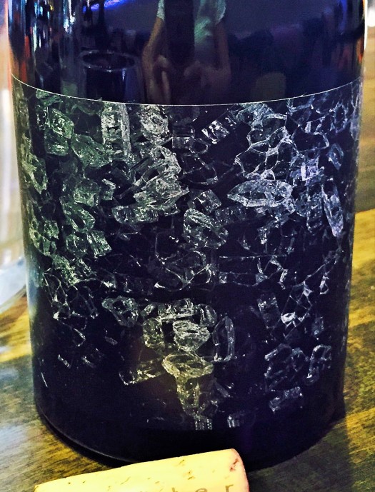
Shatter, an Orin Swift wine—a brand well known for some of the coolest labels around—clearly demonstrates an Abstract style label, obviously following the rules of this type of art: nothing is really identifiable. The patterns and shapes are non-representational. They are “shatter” itself, just random forms. The sharp black background makes the white pop. Shatter is a collaborative effort between Dave Phinney and Joel Gott. What that means is that the cool label matches the cool wine beneath. One hundred percent French grenache, this is a deep, dark, and delicious wine.
Conceptual
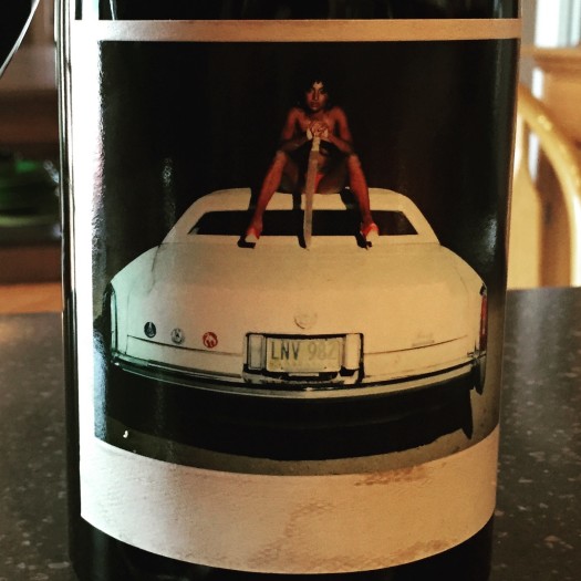
Another Orin Swift label worthy of mention (there are many more that could be included) is the Conceptual style label of Machete. This bottle actually comes with one of twelve different possible labels, all with a machete somehow as part of the art. All the labels represent a surreal, conceptual, modern style. The items are real, but the representation of the items is strange or dreamlike, more fantasy than actual life. The petite sirah, syrah, and grenache blend is a very real wine, though…and it is really good!
Impressionist
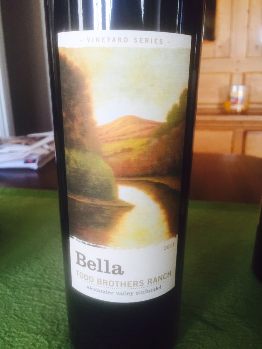
The original form of “modern” art from the late 1800s was the Impressionist style, made famous by the likes of Claude Monet. This school of art uses every day subjects, yet through fine, visible brush strokes and complimentary colors, portrays “natural” light and the sense of movement. Bella Winery uses a beautiful impressionistic label on many of its zinfandels. The gorgeous colors show the light and beauty of northern Sonoma County clearly through this work of label art.
Realistic
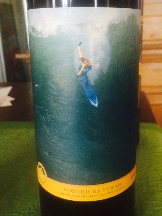
The style of Realist art sounds as if it could be less exciting than other forms, but quite the opposite is true. Realistic art simply means that the subject is represented truthfully; it looks like what it really is, without the element of fantasy. Longboard Vineyards’ take on the beauty of surfing is breathtaking in this label for the Maverick Syrah from the Russian River Valley. Surfer-turned-winemaker Oded Shakked works the elements of his first love, surfing, into all facets of his wine. It is a stunning combination for both the senses of sight and taste.
Stylized
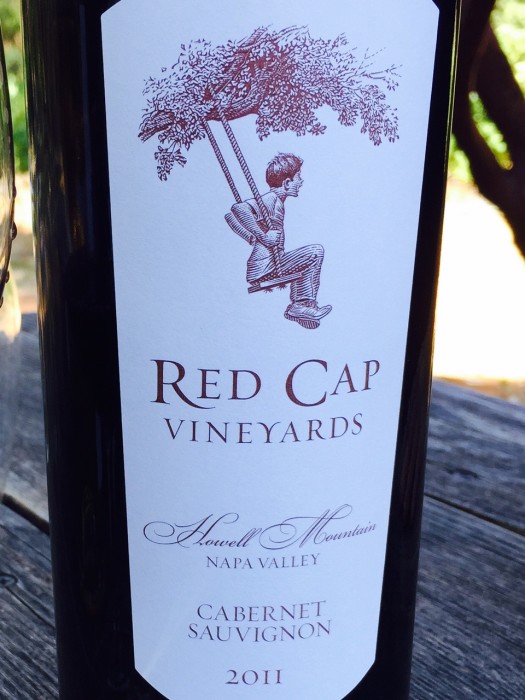
Stylized art is a close relative of realism. Shown in the Red Cap Vineyards Cabernet Sauvignon label, it is clear to see that stylized works unmistakably represent their subjects. However, there are elements of the art that are not realistic, whether it is proportion, color, or dimension. Red Cap’s swinging boy in one solid color—burgundy—portrays the youthful joy the cabernet of Howell Mountain gives to the wine. The label and the wine will both make drinkers very happy.
History

Another form of realism is seen in art that acts as historical documentation. Parrish Family Vineyards’ label boasting P.O. Box 1 does just that—documents the winemaker’s family history in the Paso Robles region. David Parrish’s granddad was issued the first postal box in the small community of Atascadero; his home is also a present-day museum in the small town. David felt this history led him to his wine career today, and he displays this proudly on the front and back labels of the majority of his wines.
Byzantine
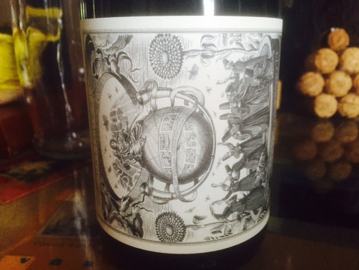
A take on classic Byzantine art is Virginia Marie Lambrix’s VML Russian River Valley Pinot Noir label. Byzantine art is known for having religious and imperial influences; in other words, this art focuses on the church and the monarchy. Religious icons are common. Lambrix, a proponent of biodynamic farming, pays homage to the gods of the sun and the moon on this striking black-on-white label with definite religious undertones. The RRV pinot inside is also a striking example of the region’s star grape.
Memorials
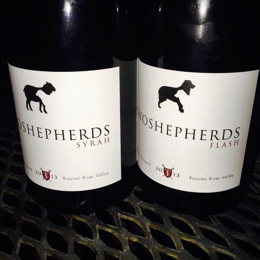
Many different art forms use pieces in memoriam to someone special; we see examples in music, poetry, and dance. It is also true of William Allen’s Two Shepherds Flash 2012 syrah. As all memorial pieces, this is a tribute to William’s winemaking sidekick, his Australian Shepherd, Flash. The label reflects William’s faithful companion, but one does need to take a close look to see. The Flash in memoriam label mimics Two Shepherds’ original label with the difference in the animal. Smart and thoughtful, this is one of the best tributes ever, and a superb wine as well!
Minimalism
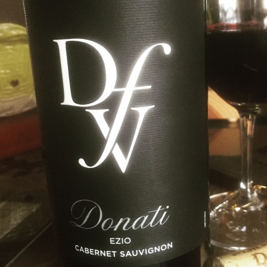
Minimalist art uses a “less is more” philosophy. Shapes and colors are generally very simple. These works are often modest and outstanding, all at the same time, just like the DFV Donati Ezio Cabernet Sauvignon label. The stark black background allows the white DVF to pop, so all can see the Donati Family Vineyards logo. This cab blend is named for Ezio, the Donati’s first born in the new world. The dark, sleek background reflects the dark blend of the Bordeaux grapes, with eighty percent cabernet sauvignon and small amounts of merlot, cab franc, and petite verdot.
Classic
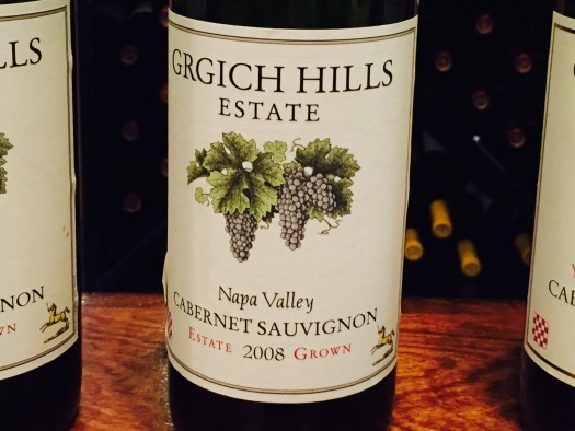
Consumers would expect nothing less than a strong, classic style label from a strong classic producer like Grgich Hills. The classic form of art continues to be incredibly important to some, and Grgich Hills, a winery that literally helped put Napa wine on the world map after the Judgement of Paris in 1976, shows its classic California wines with its classic label. The traditional purple and green of the grape clusters portrays the formal and restrained order of this style of art. However, the predictability consumers love here is the quality of the amazing wine in the bottle: classic outside equals classic inside.
Yes, what’s on the inside really does matter with wine, but the outside also plays a large part when purchasing a bottle. Whether the label is actually glittering or not, many different forms of art do represent the liquid gold within. From abstract to modern or minimal to classic, these outside covers aren’t the frog prince to be kissed in order to get to the heart of the wine. Producers spend much time and thought—and money—to have the label portray what’s beneath. Enjoy this artwork. Take a minute to analyze the cover. Judge it. And then take the bottle home to enjoy. ‘
Related:
Jerry Lohr Brings South Dakota Value to California Wine Making
Sweet Sommelier Summer Vacation: No Whining in Wine Travel
Summer, Summertime! Top Ten Black Hills Patios
Serious Side of South Dakota Wine
Celebrate Yourself! Wine and Chocolate Pairings for Valentine’s Day


